// editson
labels: typography // lettering // publication design
genre: type design
year: 2022
labels: typography // lettering // publication design
genre: type design
year: 2022
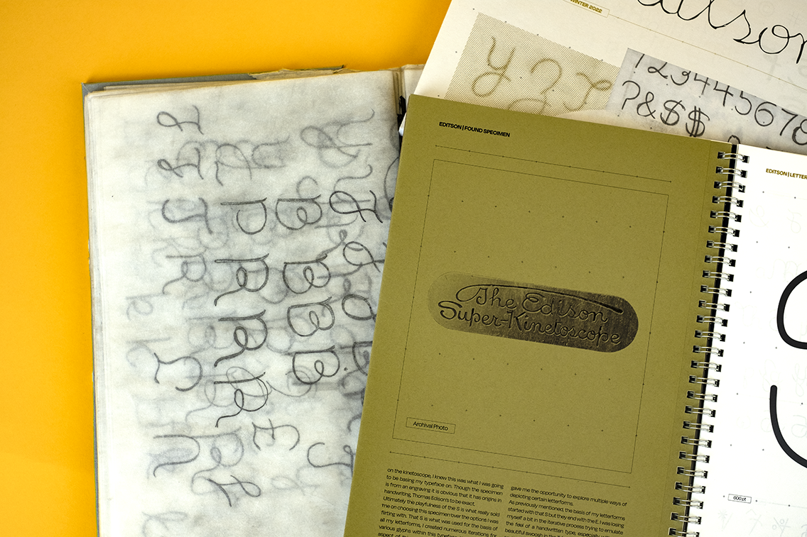
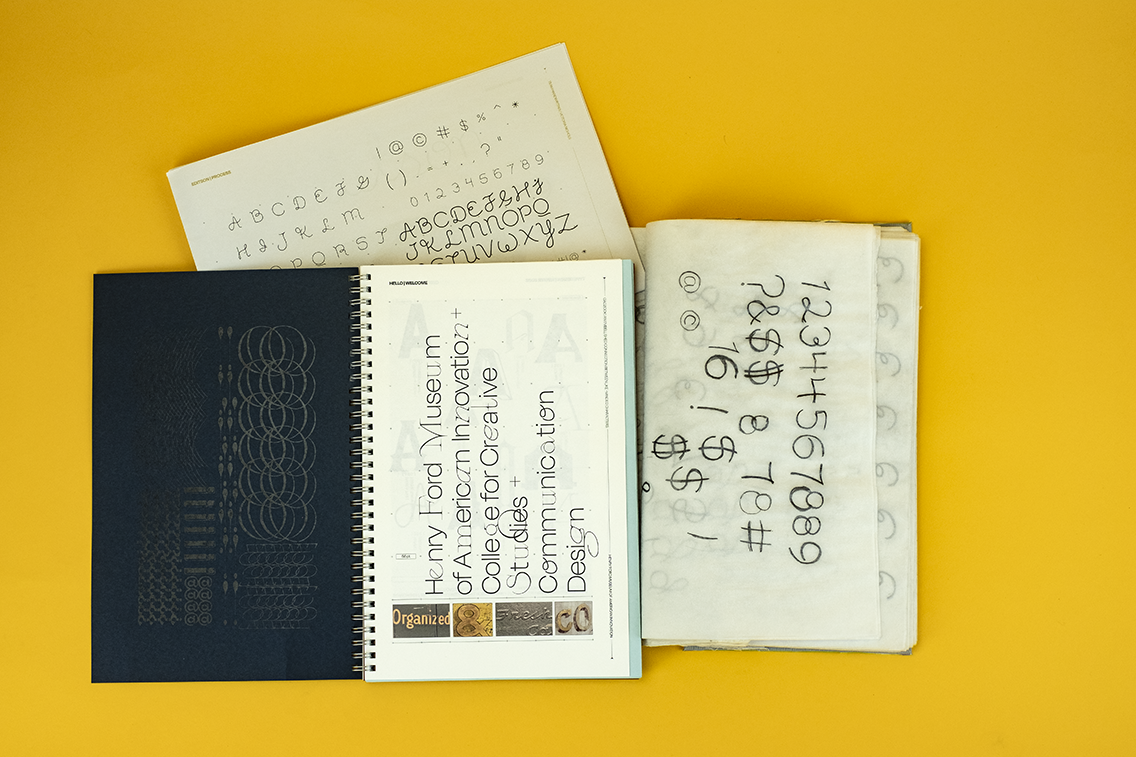
Editson is a typeface based on a sample of Thomas Edison’s handwriting. The same of this handwriting was found on an object in The archive of The Henry Ford. The specimen I chose to base my typeface on is something that I saw towards the end of a private tour. I knew from the beginning that I wanted to created a typeface based something hand painted or hand written. I really thought it was going to be based in hand-painting because sign-writing is what I am most drawn to in my personal work, however once I spotted the logotype on an old kinetoscope, I knew that was what I was going to use for the inspiration for my typeface.
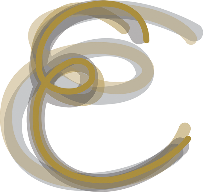
Ultimately the S in this specimen is what really sold me, it's so playful. That S is what was used for the basis of all my letterforms, I iterated tons of letterforms in the developmental stage of this typeface. The handwritten aspect of it gave me the ability to experiment with the letterforms and because of this it gave me the opportunity to explore multiple ways of depicting certain letterforms. At some point I was became a little lost in my iterative process trying to emulate the feel of a handwritten type, especially the beautiful swoosh in the T in the original specimen, so the loop from the E really helped ground me in my decisions on how unify my typeface, particularly in relation to the upper case set of my letterforms.
Ultimately the S in this specimen is what really sold me, it's so playful. That S is what was used for the basis of all my letterforms, I iterated tons of letterforms in the developmental stage of this typeface. The handwritten aspect of it gave me the ability to experiment with the letterforms and because of this it gave me the opportunity to explore multiple ways of depicting certain letterforms. At some point I was became a little lost in my iterative process trying to emulate the feel of a handwritten type, especially the beautiful swoosh in the T in the original specimen, so the loop from the E really helped ground me in my decisions on how unify my typeface, particularly in relation to the upper case set of my letterforms.


